


This is a demo article. The observations below belong to the sample studies in this publication, and are here to make the reading template useful before your own writing arrives.
The first version of the drawing had too many edges. Every plane was outlined. Every joint had a mark. There was no uncertainty about where one thing ended and the next thing began, which turned out to be the problem. The image described a room without leaving any room for the person looking at it.
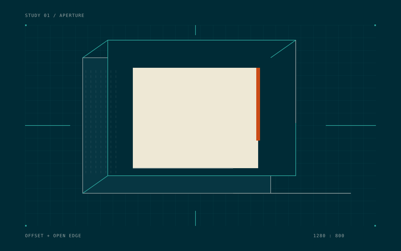
I removed the lower right edge. Nothing else changed. The opening became more convincing.
Start with the space
It is tempting to begin with the interesting character: the shaded block, the little corner, the thin line that seems to promise a complete architectural system. Those details are easy to collect. They are also easy to use as a substitute for a composition.
For the aperture study, the useful starting point was an empty rectangle. The question was how to give that empty area enough pressure to feel like an opening. A dark frame helped. A second frame, shifted sideways, made the first frame less certain. A bright edge gave the whole drawing a direction.
The work proceeded from large decisions to small ones:
- Set the opening’s proportions.
- Place the heaviest plane beside it.
- Give the empty region a route to the outside.
- Add only the marks needed to hold those relationships together.
This order is an editing tool. If a mark does not help one of those decisions, it can be removed without a long argument.
A limited vocabulary
The character set provides many possible marks, but this drawing needs only a few. Full blocks carry mass. Half blocks allow an edge to fall between rows. Thin lines establish a frame. Shading characters soften a transition where the geometry might otherwise become too definite.1
That is enough material to make a space. Adding another kind of mark introduces another visual rule, and every new rule asks for attention.
A blank cell is a decision with exactly the same dimensions as a filled one.
That sentence became a useful test. Empty cells can make a passage, set a distance, or let one structure disengage from another. They are part of the drawing’s material.
Name the rule before adding detail
A useful rule can be plain enough to write in a notebook: “frames move to the right as they recede,” or “the warm color touches only the opening.” It does not have to explain the whole image. It gives the next decision something to answer to.
For a simple grid study, a rule might look like this:
// A sketching rule, independent of the site's ANSI renderer.
const opening = { left: 26, top: 8, width: 24, height: 18 };
const offsets = [0, 3, 7];

for (const offset of offsets) {
  drawFrame({
    ...opening,
    left: opening.left + offset,
    top: opening.top - Math.floor(offset / 2),
  });
}

eraseEdge('lower-right');
The important part is the relationship between offsets and the opening. Three unrelated frames would make a collection. Three frames that answer to the same displacement make a structure.
The rule also makes revision specific. If the image feels flat, change the displacement. If it feels busy, remove a frame. If it feels sealed shut, change the edge. “Make it more interesting” is difficult to act on; “give the empty region a route out” is a drawing instruction.
Save the version before the improvement
The earlier version is useful evidence. It shows what the extra edges were doing, and why the smaller vocabulary helps. Keeping it costs very little. Trying to reconstruct it later costs a great deal more.
The accompanying note only needs to say what changed:
- Removed the lower right boundary.
- Shifted the far frame three cells to the right.
- Kept the warm accent in one place.
- Reduced the shaded area until the opening could breathe.
These notes are more useful than assigning each version a score. A score says which image was preferred. A note gives the next image a place to begin.
Give the narrow drawing its own proportions
A composition that works across eighty columns may depend on a large distance between two forms. Shrinking it keeps the cells but changes the experience. The marks become a texture before the form becomes a place.
The narrow drawing begins again with an opening. The support shifts upward. The heavier plane becomes taller and less wide. Some small marks disappear because their job belonged to a distance that is no longer present.
It helps to ask three questions of the new version:
- What is the first shape the eye finds?
- Where does the empty area lead?
- Which detail can survive at the intended size?
The answers should be visible in the drawing. They do not need to match the wide composition exactly. The shared vocabulary is enough to make the two images relatives.2
Stop while the edge is still open
There is a point in a small drawing when every new detail needs two more details to explain it. That is usually a good moment to save the file and look away.
On returning, the useful test is simple: can the image still be described in a sentence? “Two displaced frames around an opening” gives the drawing a center. If the description becomes a list of effects, the smaller decisions may have taken over.
The finished study still has an unresolved corner. It is the part that makes me want to look at it again. The notebook can hold the possible solutions; the image does not need to contain all of them.
The Open room project collects the study, and the experiments gallery shows the actual ANSI compositions with their source files.
Footnotes
-
A character cell has width and height. Thinking about both dimensions helps a half block behave like part of a plane instead of a decorative glyph. The experiments page documents the particular proportions used here. ↩
-
Keeping related versions together also makes their differences easier to describe. A caption can name the changed proportion instead of explaining the whole project again. ↩